KURT COBAIN AND THE JAPANESE REINTERPRETATION OF GRUNGE
1/6/2026
Author: Soukita
HOW A TOURING WARDROBE BECAME A REFERENCE, AND HOW JAPAN BUILT IT THROUGH
PRINT CULTURE
While we remember Grunge as a look, it started as nothing more than clothing chosen for its functionality.
Touring bands needed clothes that could take a beating: long drives, cold load-ins, rehearsal rooms that smelled like damp amplifiers, nights that ended late and began early. What worked got worn again. What didn’t, disappeared. A flannel stayed in rotation because it layered easily. A striped knit stayed because it was weathered and forgiving. A cardigan stayed because it warmed you up fast. A pair of jeans stayed because it survived being sat in, slept in, played in, and pulled on without thinking.
That is the first step in how a “uniform” forms without anyone designing one. Repetition produces shape. Wear produces surface. And once a camera starts to return to the same person, the same pieces start to read like choices, even when they began as a convenience.
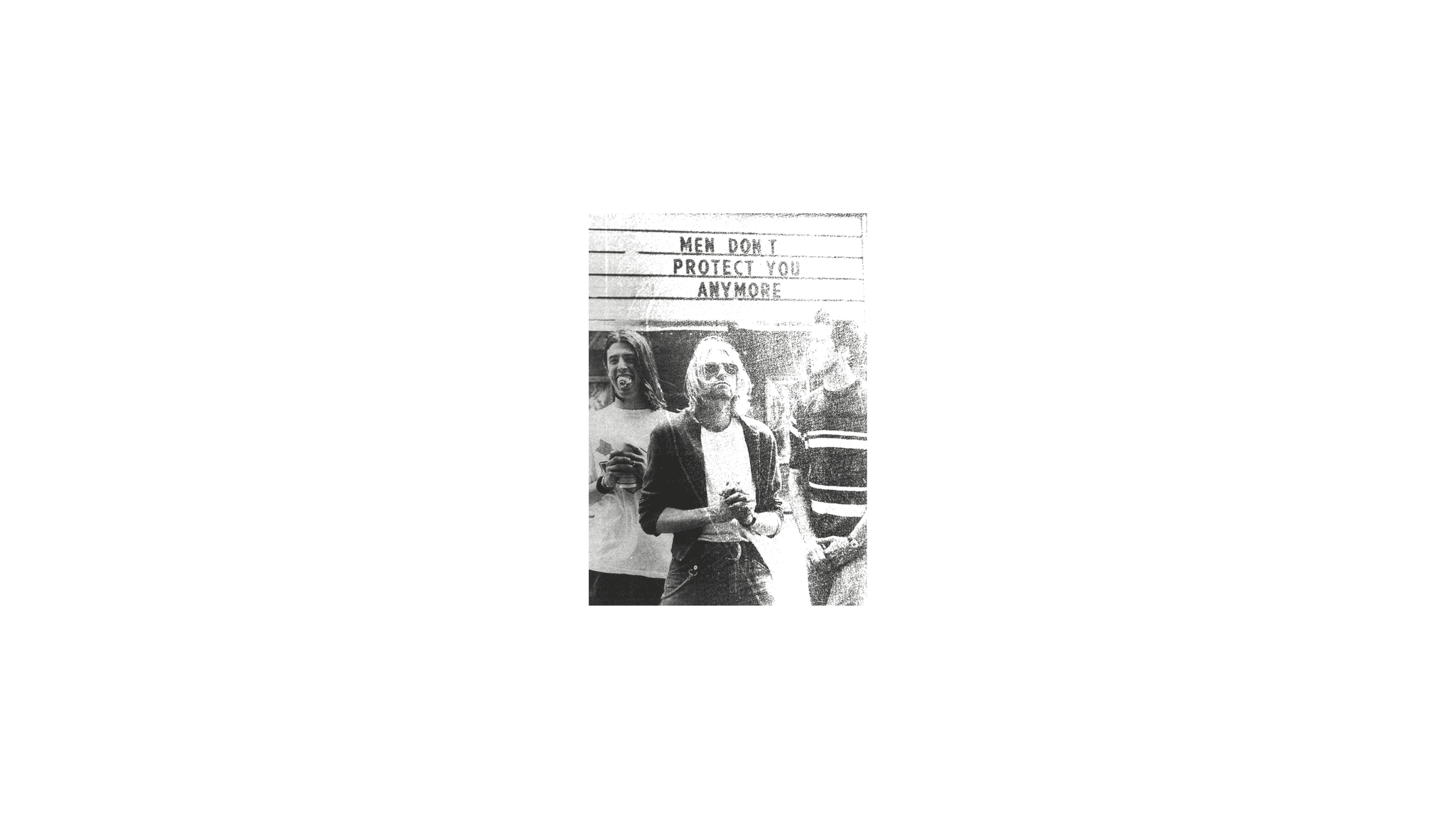
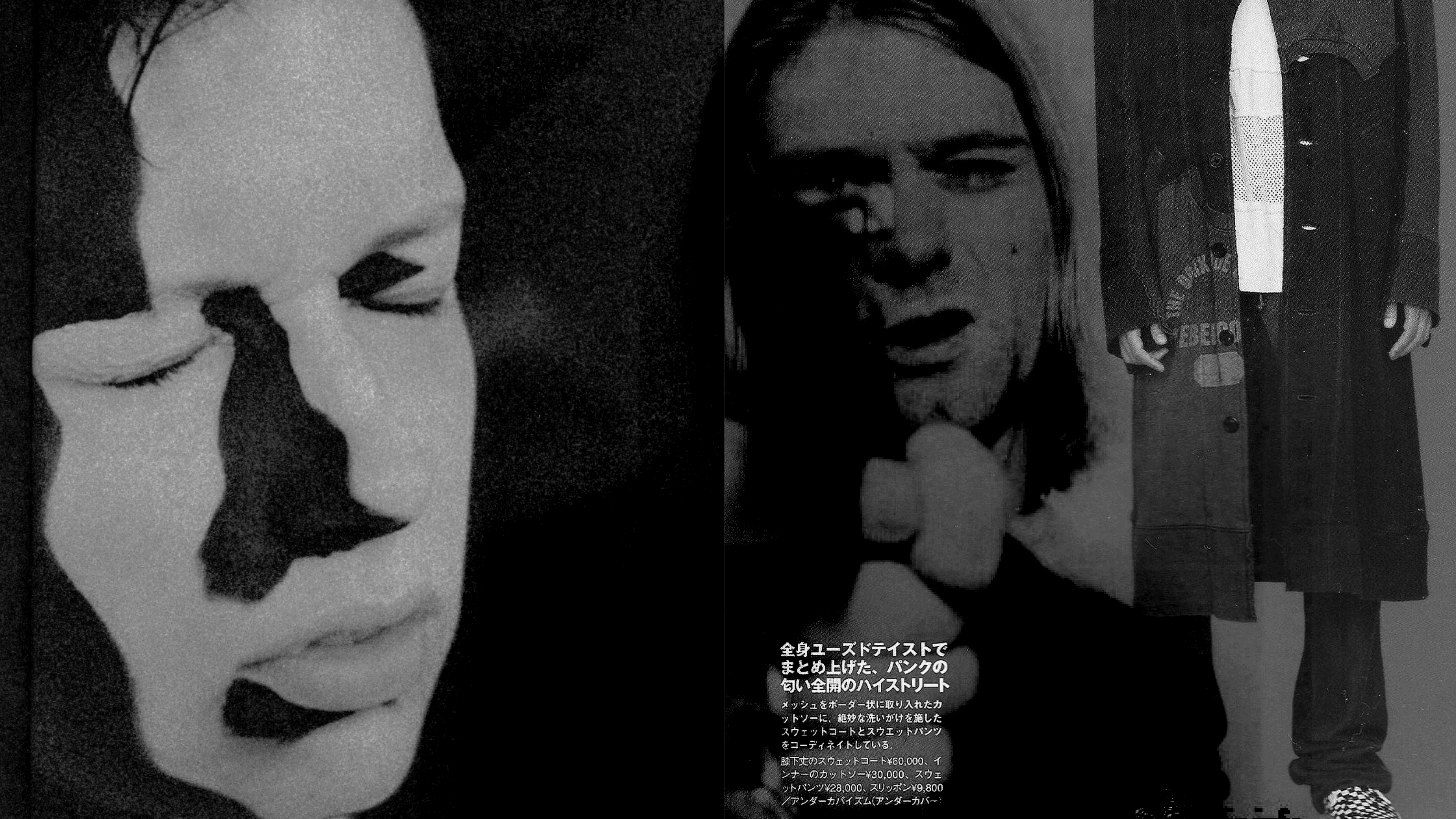
Kurt Cobain remains a focal point because he balanced global visibility with a persistent, unwashed realness. People documented him relentlessly, and he kept dressing like someone who had to move, sweat, wait, and play. Over time, the details of what he wore did the work: the fuzz of mohair, the drag of denim, the way sleeves ran long, the way layers collapsed rather than held. The image became easy to recognize because it didn’t change.
HOW A WARDROBE BECOMES A REFERENCE
A reference isn’t one outfit. It’s a pattern you can recognize, then reuse.
In grunge, the pattern reads through texture and wear:
knits that pill, shirts that sit a little slack on the body, broken-in denim that creases at the knees, shoes worn past the point of ruin. Nothing is clean cut or fresh. The silhouettes stay loose, and the surfaces keep showing the life that happened in them.
Grunge cues have traveled so far from their origins that they no longer belong to a single scene; they have become a shared global vocabulary. A designer can cite grunge without copying a single image. A magazine can name it without referencing Seattle. A teenager can wear it without ever hearing the first record.
JAPAN ENCOUNTERS GRUNGE THROUGH MEDIA
Japan did not need proximity to understand grunge. The look traveled through the same channels the music did: imported records, music television, photography, and print.
Nirvana’s Japan run in February 1992 gave that circulation a real anchor, dates people could point to, posters you could keep, and stories you could retell. The tour hit Osaka (Feb 14), Nagoya (Feb 16), Kawasaki (Feb 17), and Tokyo (Feb 19).
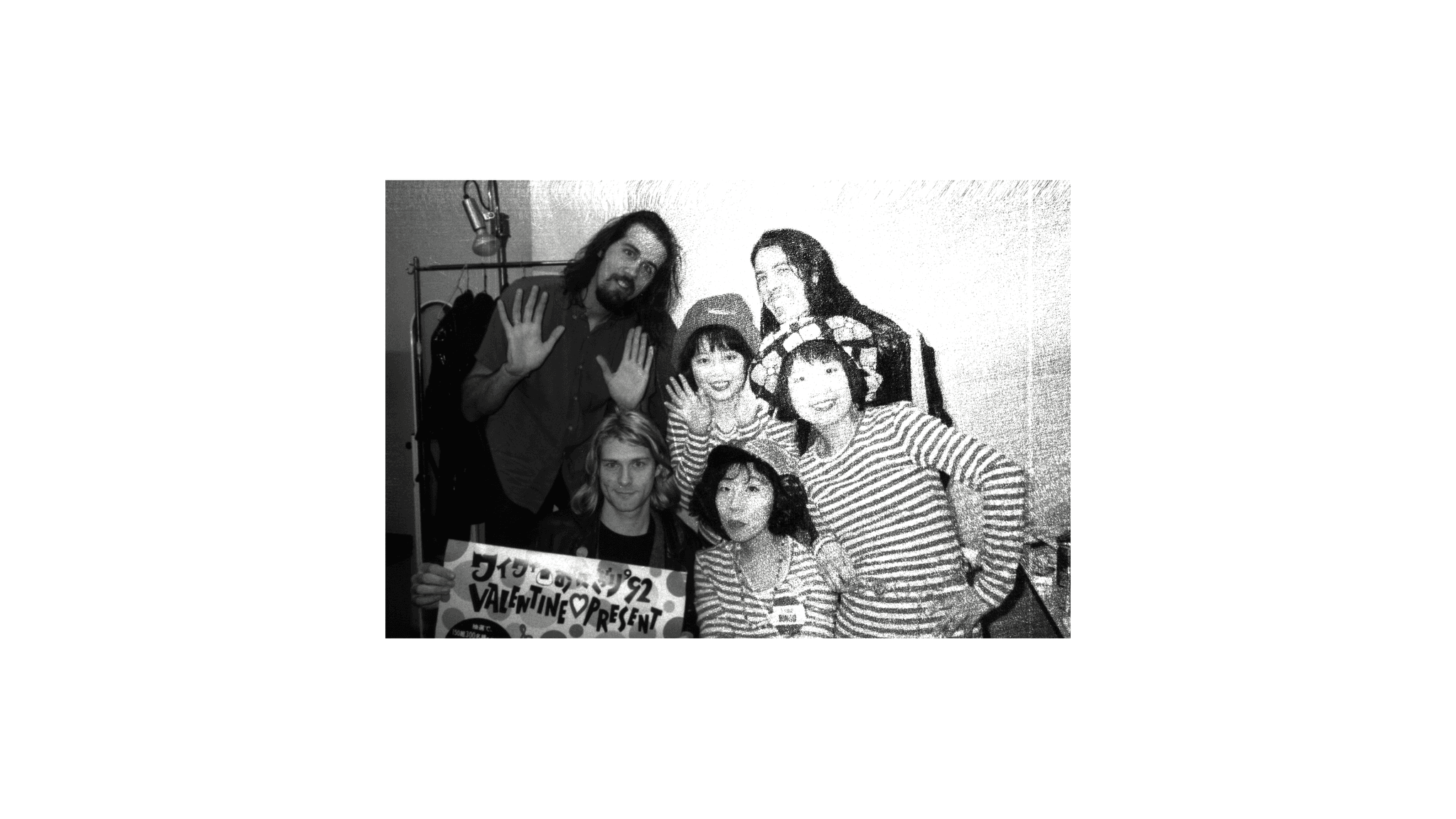
But the deeper story is bigger than the concerts. Japan already had the habits in place for a style like this: a mature culture of cataloging taste. When the look arrived through print and coverage, it was not treated as disposable. It was treated as material.
PRINT CULTURE AS TASTE INFRASTRUCTURE
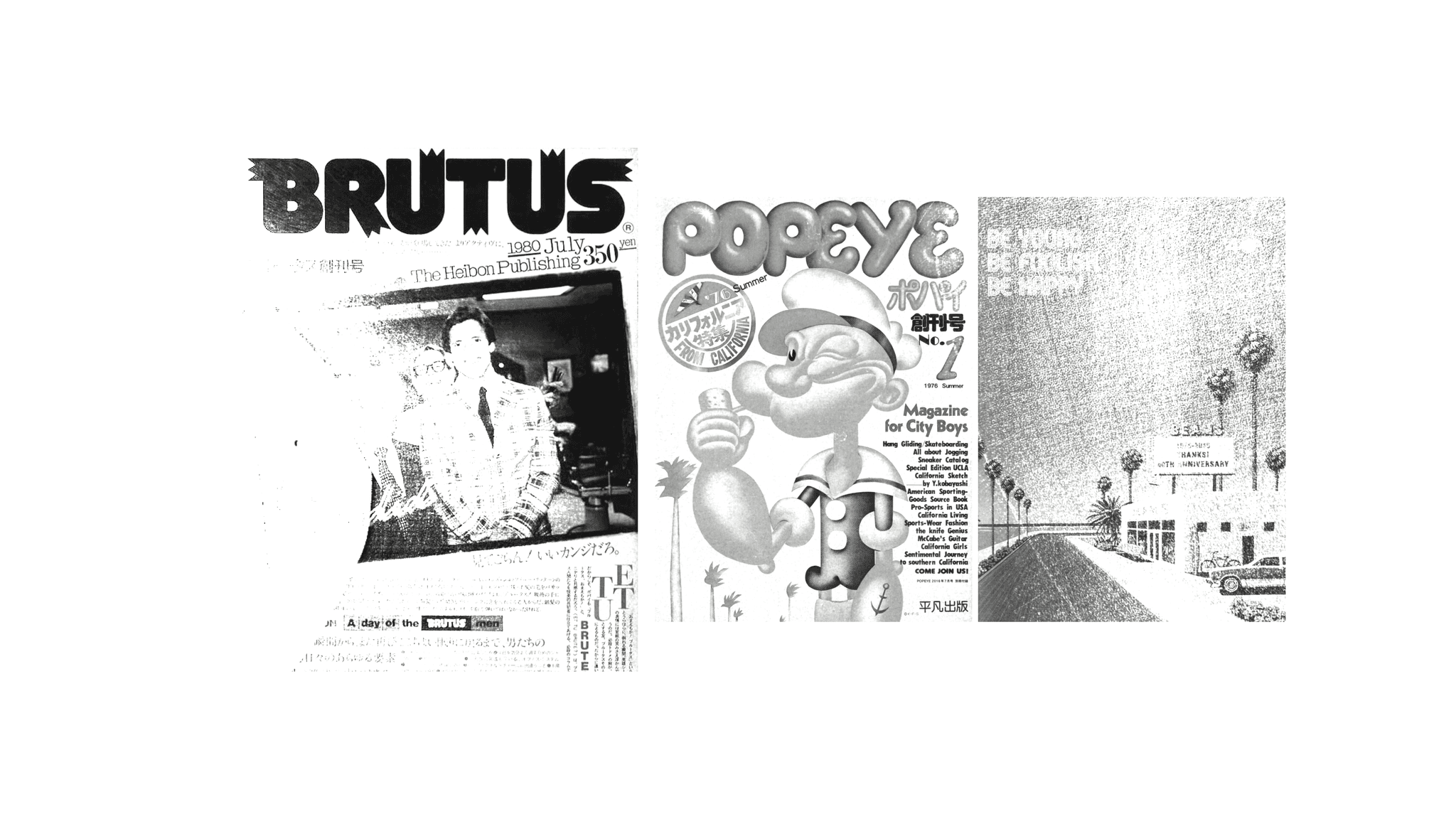
Long before social feeds, Japanese magazines taught readers how to read style. Popeye (1976) and Brutus (1980), both from Magazine House, turned culture into repeatable cues through objects, places, and outfits.
Street documentation pushed that further. Shoichi Aoki founded STREET in 1985, then launched FRUiTS in 1997 with a simple, lasting format: a full-page portrait, a short profile, and a list of brands. Outfits became records you could file and
return to.
By the time designers began translating grunge into runway language, Japan already had a working system for turning a fleeting scene into a stable reference: photograph → caption → brand name → store → wardrobe → new photograph.
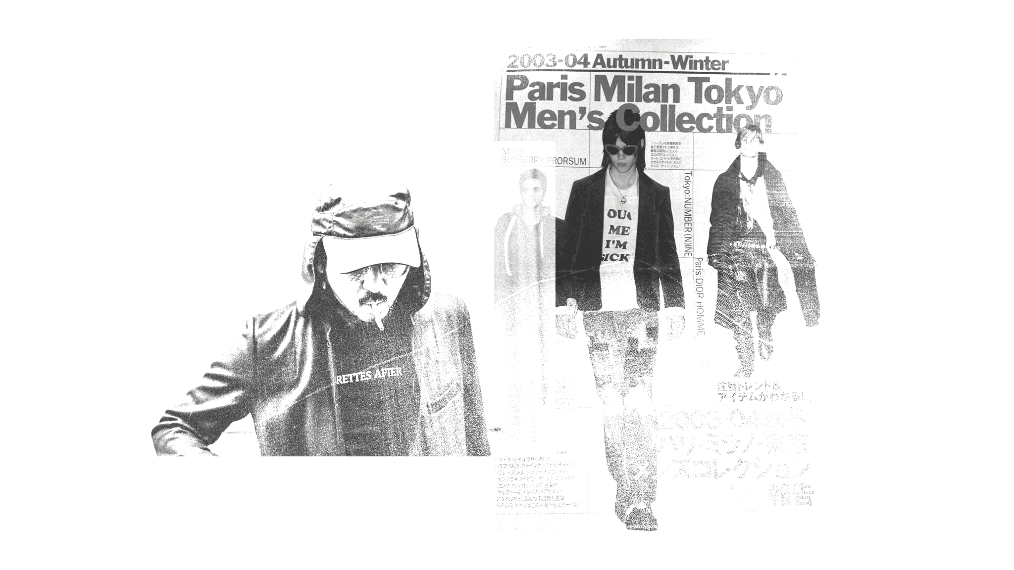
NUMBER (N)INE AND THE LOGIC OF CITATION
If grunge begins as repetition, Number (N)ine shows how repetition becomes authorship.
Takahiro Miyashita established KOOKS CO., LTD. in November 1996 and launched Number (N)ine the same year. From early on, the label treated music less as an influence and more as structure: titles that behave like liner notes, graphics that behave like merch, garments that behave like memory.
The 2003 season title “Touch Me I’m Sick” makes that system unmistakable. It borrows directly from Mudhoney’s debut single, released by Sub Pop in 1988. In one phrase, Miyashita points to the source and invites you to read his clothes through it.
Number (N)ine didn’t stop at putting music in the season names. Sometimes the reference is sewn into the garment itself, and you only find it when you’re close: a music-staff motif sitting inside the back collar, or turned into a lining detail inside a cuff. It’s small on purpose.
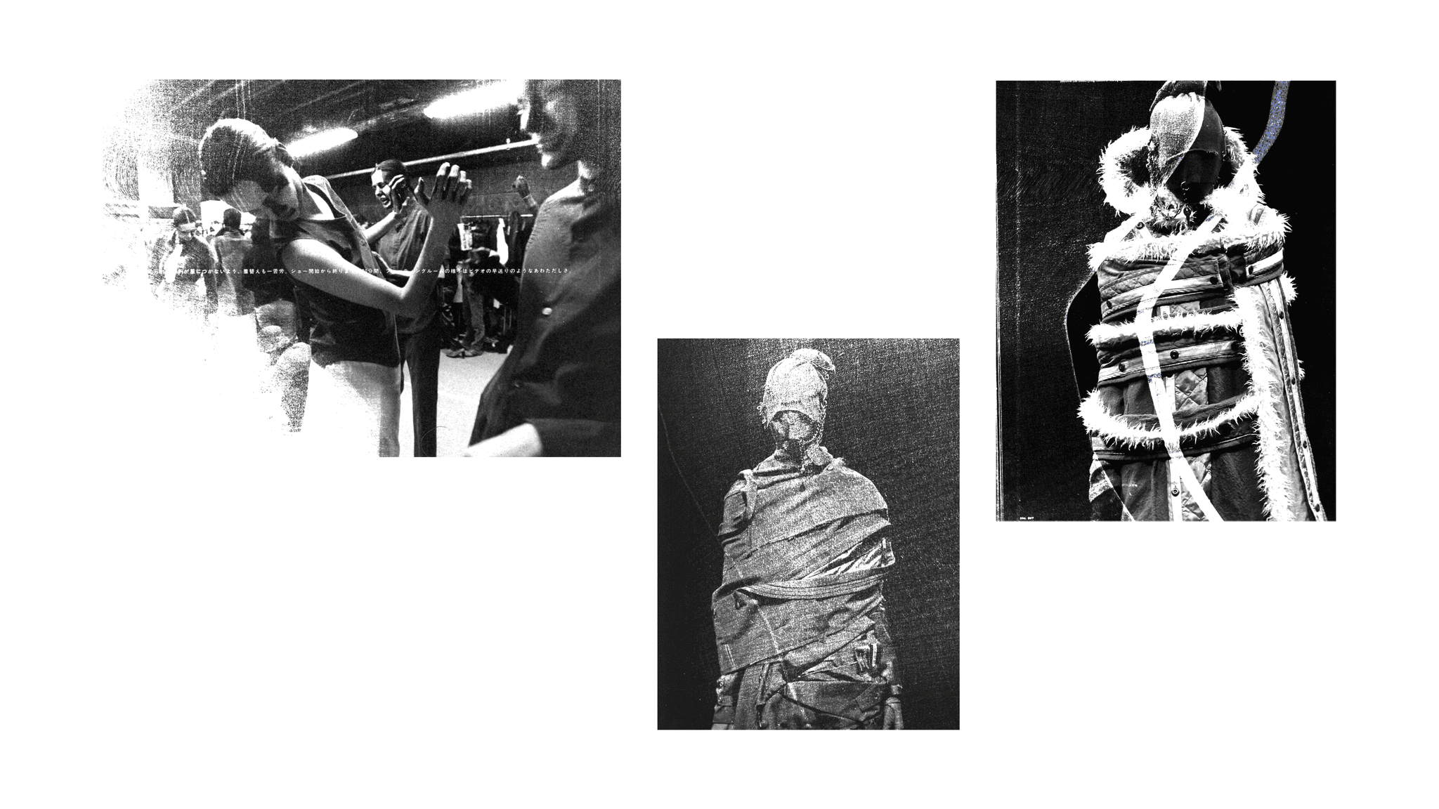
The collection’s grunge connection is most convincing when it stays close to how the original wardrobe worked: clothing that looks lived in, kept in circulation, repaired, reworn. Miyashita doesn’t present “Cobain cosplay.” He’s making garments that feel like they’ve already had a life, even when the construction is meticulous, because the garments carry the story of use.
And that is where Japan’s reinterpretation becomes distinct. The point isn’t to keep grunge raw. The point is to make grunge repeatable inside a fashion system that values intention, detail, and controlled construction.
UNDERCOVER AND THE BAND-MERCH BLUEPRINT
Undercover reaches the same territory from a different direction: community signaling.
Jun Takahashi founded Undercover in 1990, and the label’s relationship to music runs through its identity. In Spring/Summer 2006, the collection titled “T” makes the mechanism explicit by treating the T-shirt the way music culture does: as a fast, readable badge. The project included imagined bands designed under a fictional label, “Undercover Records,” extending the idea of merch beyond existing references into a constructed scene.
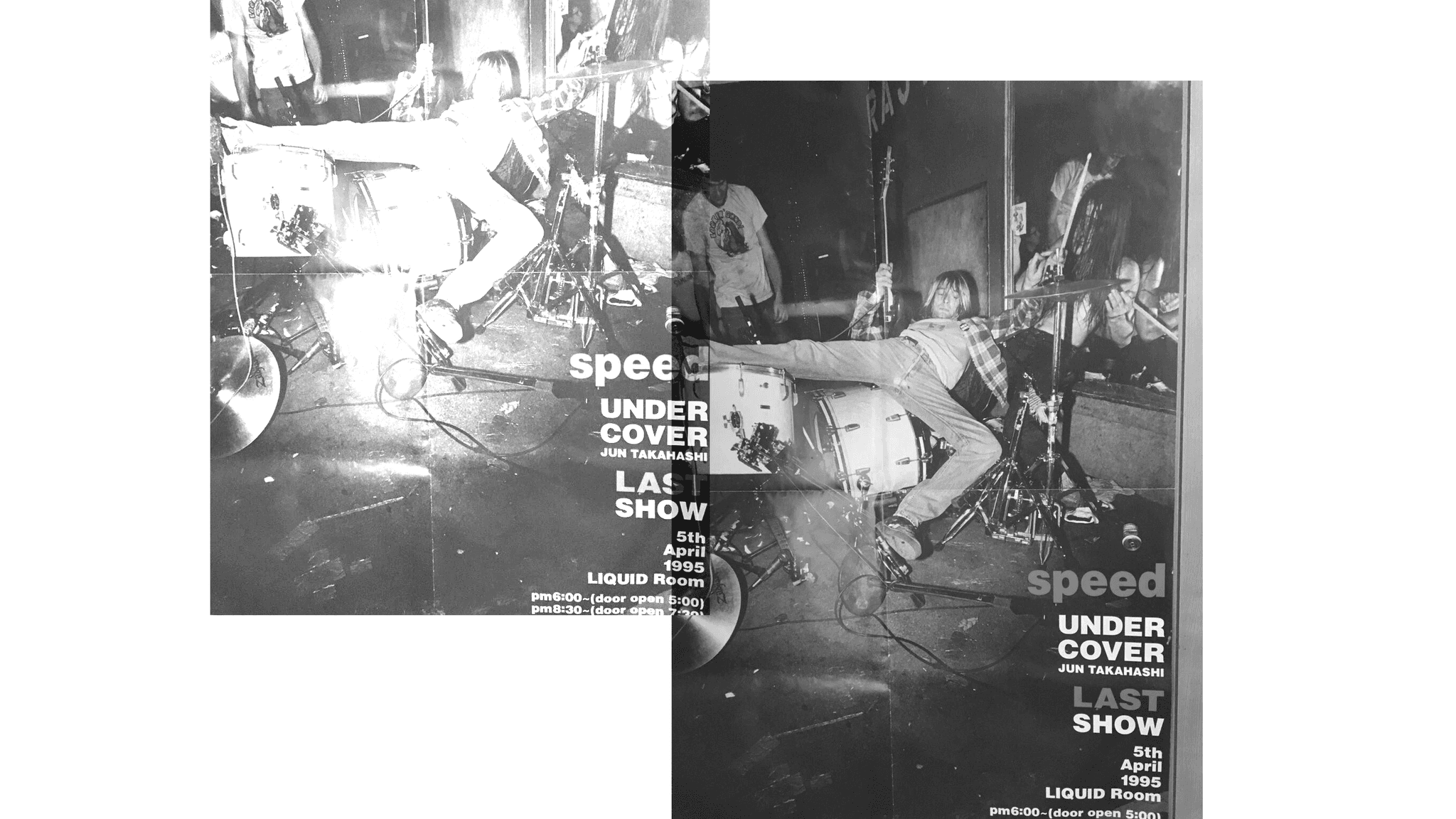
In the same era, Undercover’s music language also shows up in denim, where Takahashi uses single, readable marks the way music scenes use insignias. A well-known example is the lightning-bolt motif placed on Undercover pants, widely documented as an homage to Patti Smith’s lightning-bolt knee tattoo. It fits Undercover’s broader method: build a world where music is the symbolic system the clothes speak in.
In plain form, this is how subculture becomes wardrobe. Music scenes do not only spread through sound. They spread through symbols that travel quickly: a shirt front, a back print, a name, a logo, a tour-type graphic. Undercover turns that circulation model into fashion method.
In grunge, the mechanism was repetition. Cobain’s constant visibility in photographs, television, and live footage fixed a set of cues that could be copied: slouch, wear, and a refusal of polish. Undercover repeated those cues through recognizable, purchasable formats.
IT WASN'T ONLY TWO BRANDS
Number (N)ine and Undercover offer clean case studies, but they sit inside a wider Japanese pattern: fashion built in constant conversation with music.
Hysteric Glamour, founded in 1984 by Nobuhiko Kitamura, treats rock and pop graphics as core product language: tees and imagery as daily identity, worn on repeat. GOODENOUGH, established in 1990 by Hiroshi Fujiwara, sits in the same lineage of music, street culture, and staple-making, clothes designed to function like membership, familiar, legible, and meant to be lived in.
LAD MUSICIAN, established in 1995, builds menswear that keeps one foot in music, a sharp silhouette with a romantic edge, framed by band culture. NEIGHBORHOOD, founded in 1994 by Shinsuke Takizawa, comes in from a different angle, punk and motorcycle subcultures, but lands in a similar place: worn-in uniforms, tough materials, and symbols that hold up through repetition.
beauty:beast belongs here too, even if sources differ on the exact founding year (often placed around 1990–91). The label is consistently described as emerging from early-1990s Harajuku/Urahara energy with punk as a key influence, filtered through a more crafted, idiosyncratic design language.
And the pattern doesn’t stop in the 1990s. WACKO MARIA, established in 2005, states music as its foundation outright, keeping the idea of clothing-as-culture alive well into the era when grunge had already become history.
Taken together, these brands show why “Japanese grunge” can’t be reduced to two runway moments. Japan already had a long-running habit of turning sound into wardrobe systems. Cobain-era grunge arrived as one more powerful reference, and Japanese designers handled it the way they handled many references: by giving it form that could survive repetition.
CONCLUSION
Grunge started as a touring wardrobe built to solve practical problems. Cobain’s visibility turned those practical choices into cues the world could read at a glance. Japan received those cues through a different advantage: a strong infrastructure for taste, magazines that teach you how to see, and street documentation that holds onto how people actually dressed.
Designers then did what designers do at the highest level: they made the reference usable. They treated grunge like something you could rebuild with discipline: season titles that read like citations, graphics that operate like merch, and garments that keep the worn-in language of the original scene without getting trapped in imitation.